MCompass
Know Your Campus Inside Out
TEAM
Han Gao
Zhengkuan Yan
MY ROLE
UX Designer / Researcher
TOOLS
Sketch, Illustrator
Framer X
DURATION
Sep 2018 - Dec 2018
Final Design
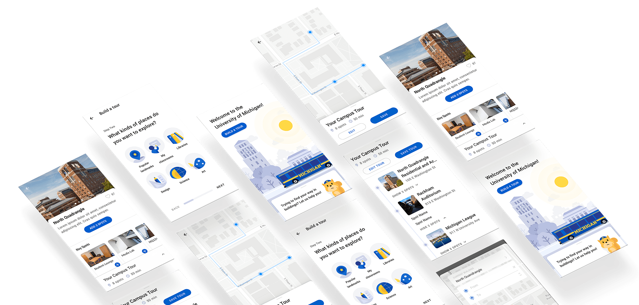
MCompass is a mobile application that helps students get familiar with campus, both indoor and outdoor, through discovery and exploration. With MCompass, you can
- Quickly generate your personalized campus tours
- Customize tours to suit your needs
- Navigate campus with confidence
Campus Tour Auto-Generation
MCompass helps users easily generate a campus tour, especially for those who are not familiar with campus and don’t know where to explore. Users will be prompted to create a tour on the homepage, and they will follow an easy process to generate a campus tour based on their preferences and schedule.
Tour Customization
After generating the tour, users can also customize the route by adding new spots to it. They can use the categories to filter the result and view building information to make better decisions.
En Route
During the campus tour, users can follow a detailed instruction to explore the campus through landmarks inside buildings.
Indoor Wayfinding
Whenever users get lost on campus, they can quicly pull out MCompass and enter their closest landmark and destination. The systen will generate the route for them to find their way.
Formative Study
Preliminary research has indicated that getting lost on campus has been a frequent issue among new students and visitors, especially in complex buildings. However, most of the current GPS navigation solutions (e.g., Google Maps) do not support accurate indoor navigation, whereas specialized indoor positioning services are often too expensive and laborious to implement.
Instead of trying to figure out “the most accurate way” of positioning, MCompass tries to tackle the problems from the beginning: helping people increase familiarity with campus through exploration tours and providing more intuitive navigations inside buildings. Currently, MCompass is developed for the University of Michigan Ann Arbor campus. A stakeholder map visually represented the groups of potential users and helped us better understand the problem and thus prioritize needs.
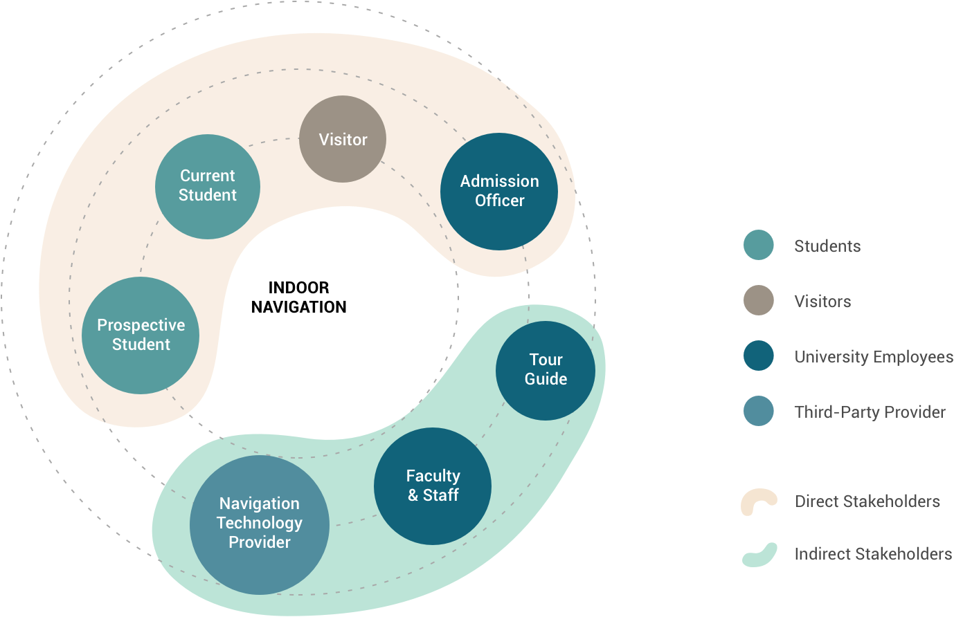
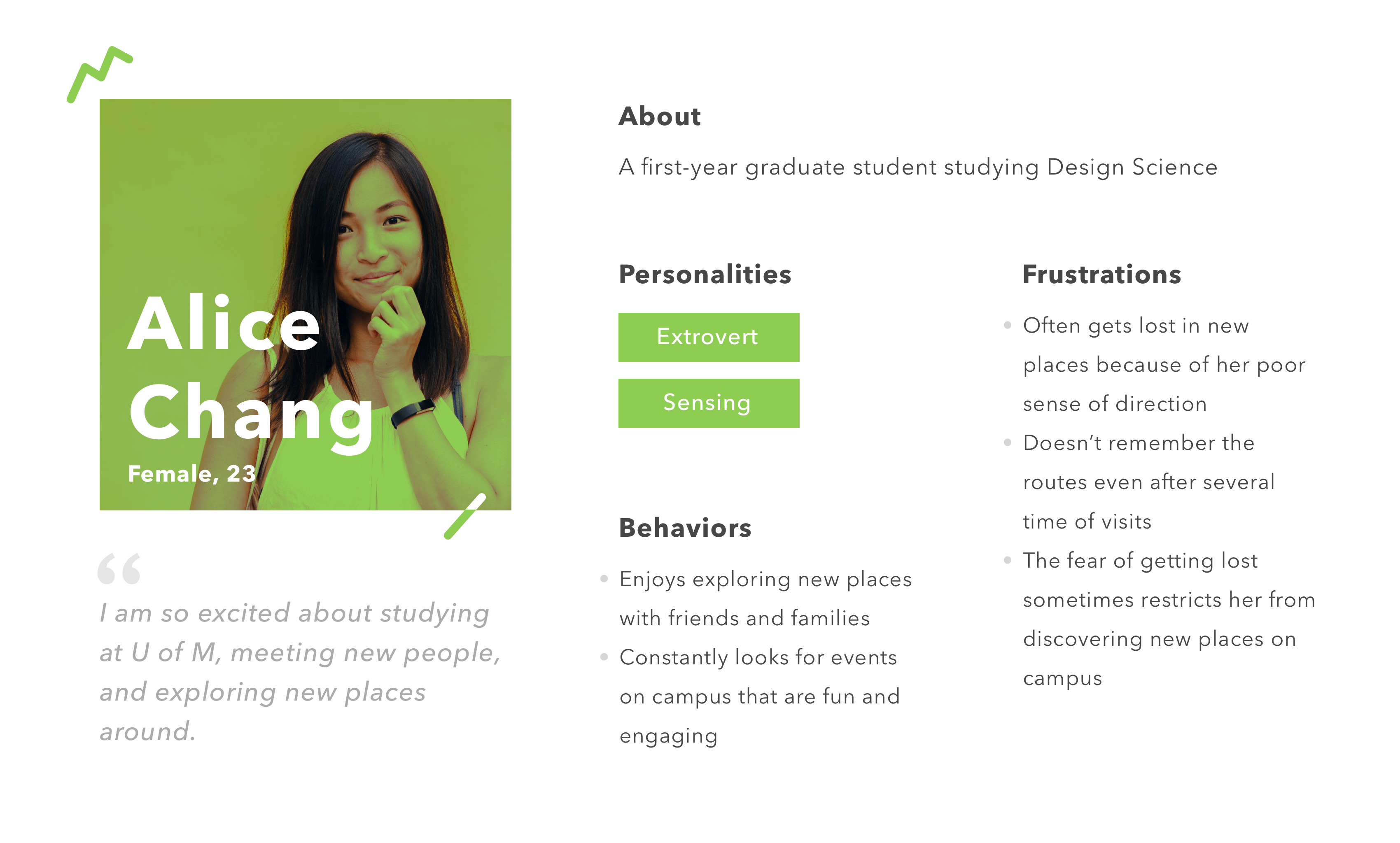
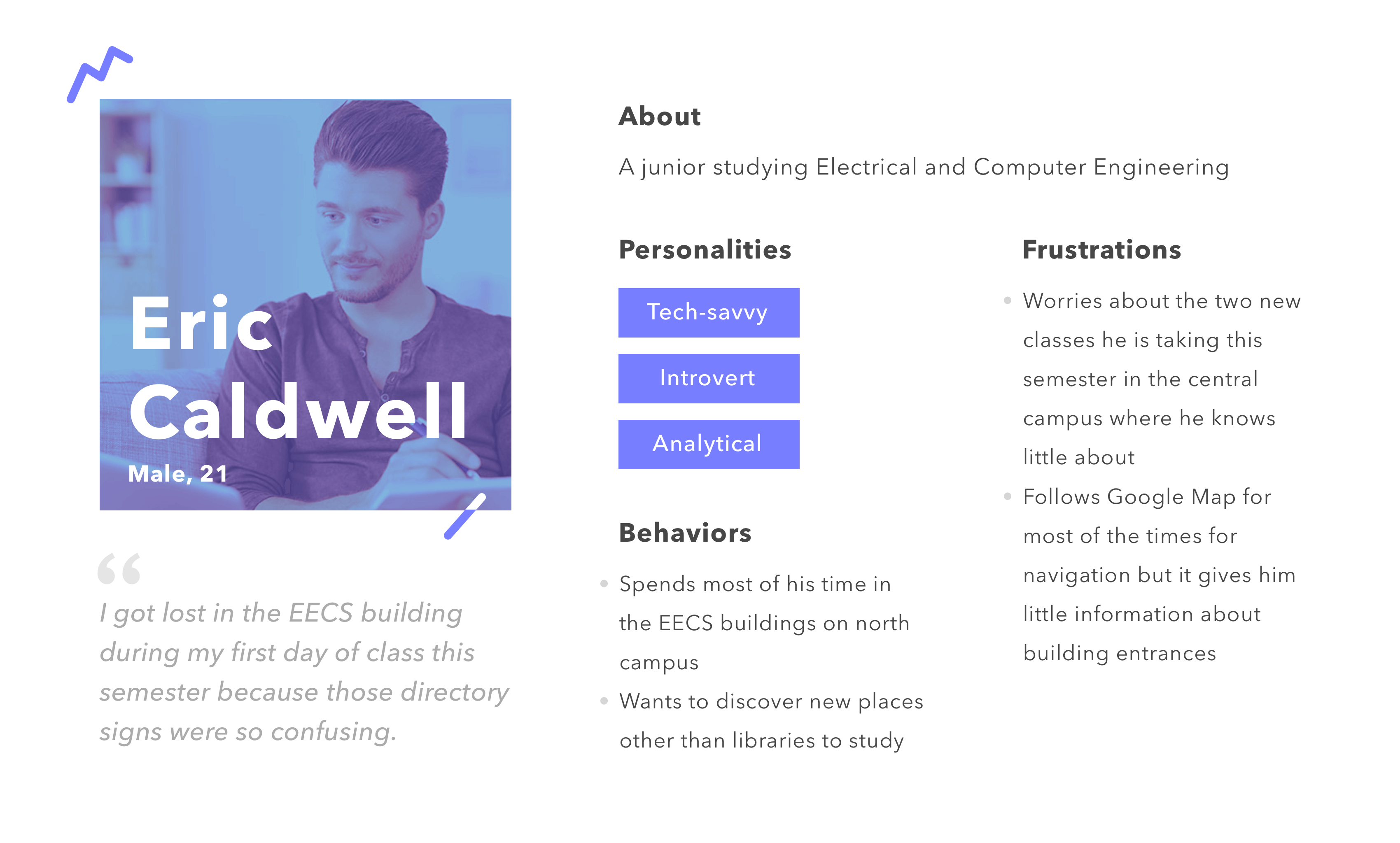
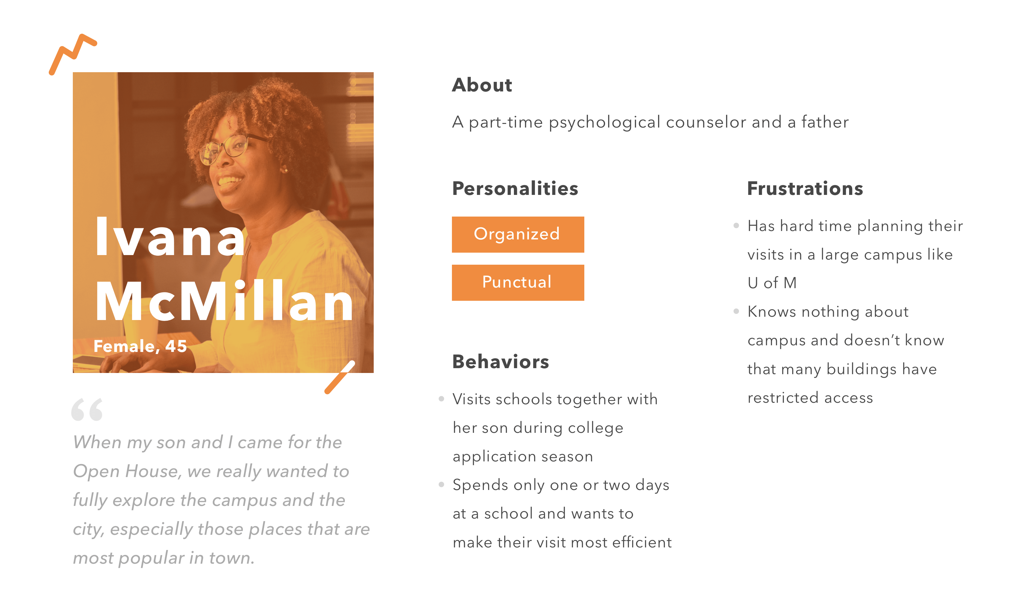
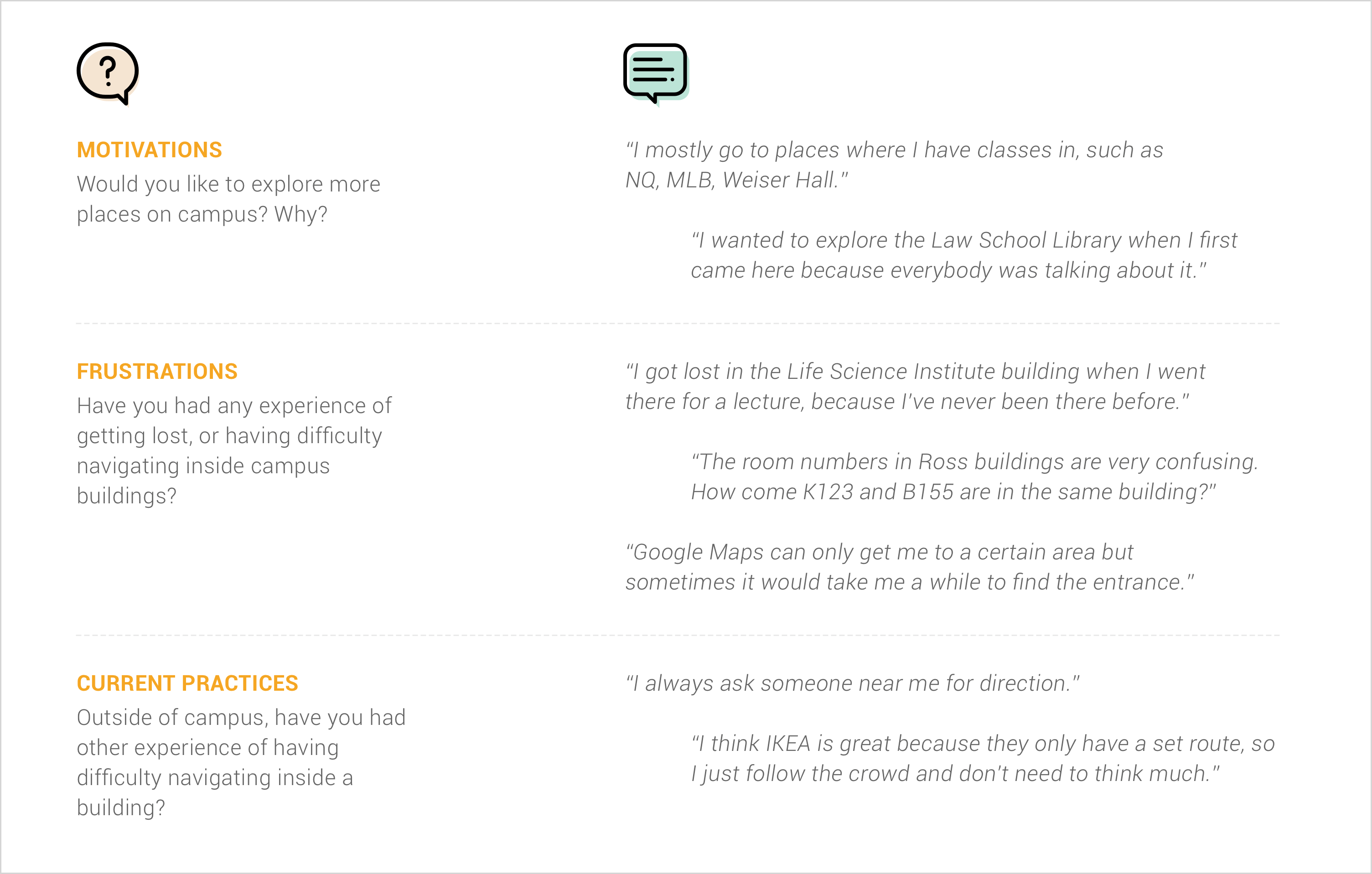
In the formative study phase, we conducted 11 in-depth interviews to learn more about the motivations, frustrations, expectations and current practices for indoor exploration and navigation from our primary stakeholders, including current students, perspective students, visitors, and parents. Let's see some of their stories.
According to the interview findings and insights, we then created three personas that capture the major types of our target users. Let's meet Alice, Eric and Ivana!
From all the formative research above, we summarized three key insights about indoor navigation and wayfinding on campus:
- People get lost in buildings that they are not familiar with.
- Directory signs are not always clear and sufficient for indoor wayfinding.
- People tend to remember indoor routes by building landmarks.
 Provide indoor navigation through landmarks instead of using costly positioning technologies.
 Help students get familiar with campus buildings through personalized and customizable camspus tours.
Prototyping and Design Iteration
Based on what we got from the preliminary research and user interviews, we were motivated to move onto the next phase and start prototyping. As shown below in a typical user journey, our designs were grounded in the entire flow of how a campus tour is generated, how campus exploration helps users increase their familiarity with campus and moreover, and how users get timely assistance whenever they get lost on campus.

Starting with wireframing, our designs went through three rounds of rapid prototyping based on user testing and feedback from milestone presentations. Here, I'll introduce three cases of how our prototypes iterated to higher fidelities.
Tour Generation: Build A Tour
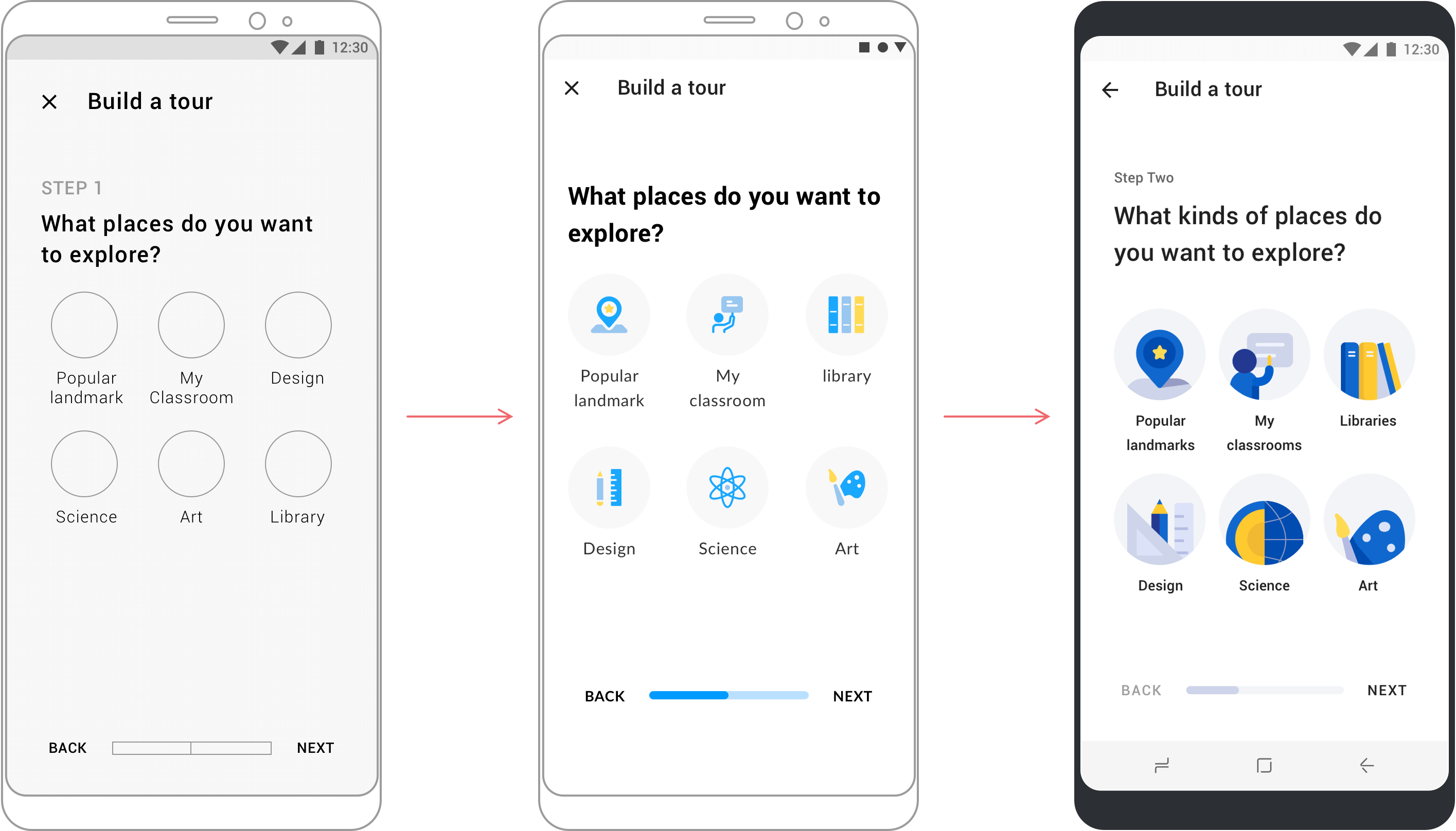
As one of the first steps in building a campus tour, we wanted to simplify the process and made the design intuitive and efficient. Different visual representations were also explored to achieve an unified visual style.
Tour Generation: Generate A Tour
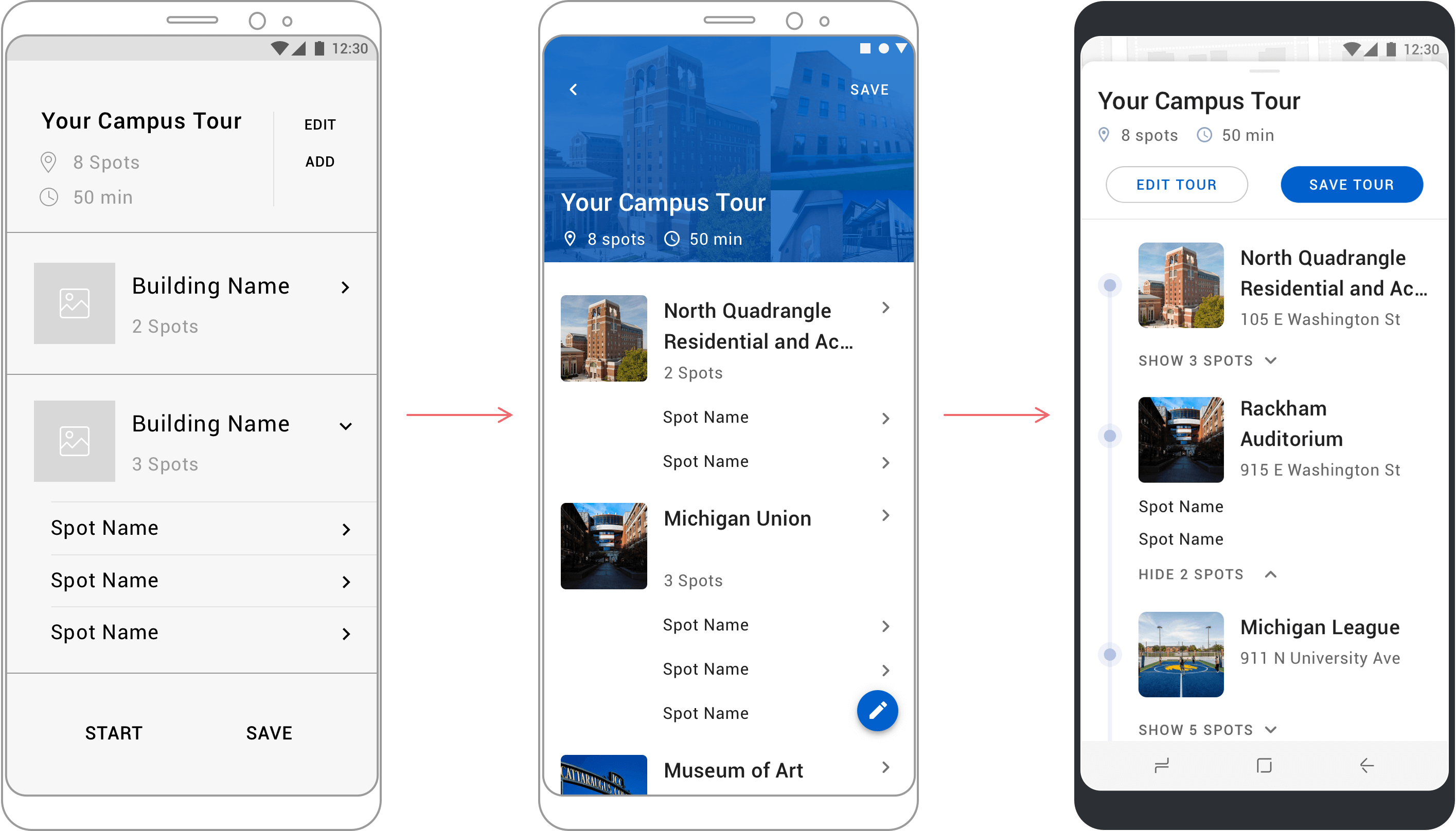
After users generate their campus tour, they may want to preview the tour and make changes if needed. Since the page will contain quite a lot information, our design aimed to deliver sufficient points of information while, at the same time, being brief and concise. The route should be consistent and easy to recognize.
Indoor Navigation: Get Directions
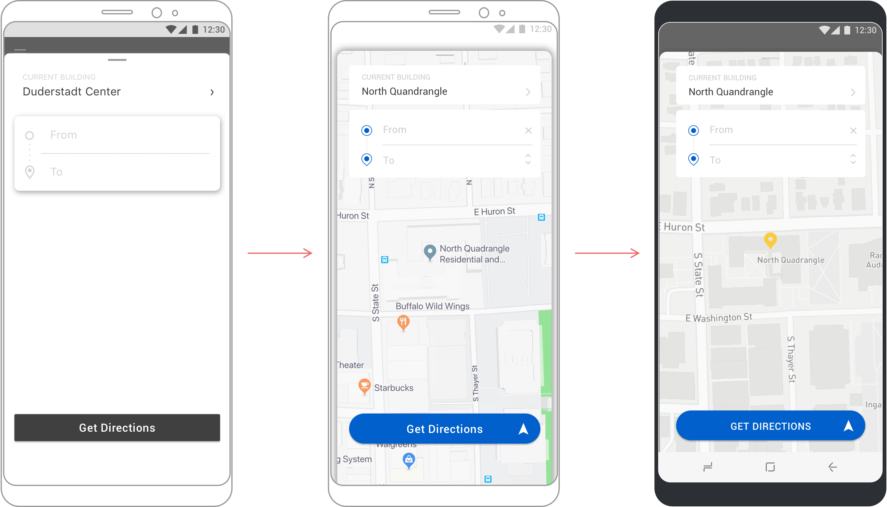
Indoor navigation should be a feature that's parallel to campus exploration. Whenever users get lost on campus and need help, they should be able to quickly access the page and get clear directions. We managed to place the indoor navigation on the home page where users can access by simply sliding up.
Visual Guide and Demo
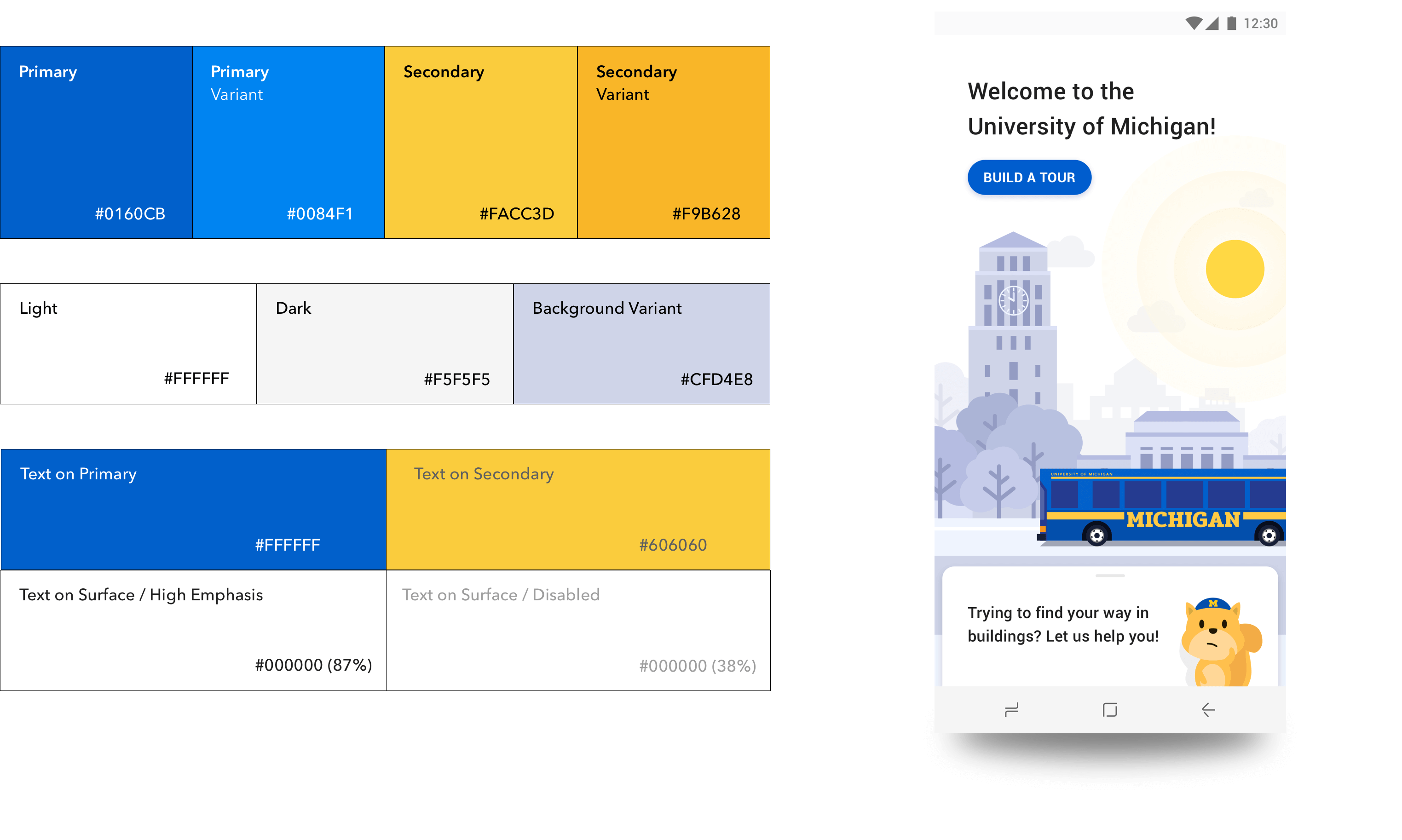
Color Scheme
Typography Scale

Video Demonstration
If you want to know more about MCompass and learn about how it may help students find their way through campus discovery and exploration, check out this video demo!
